Scraplift #17 - Fun and Funky!!! UPDATED FINALLY!
 I have finally found the next Scraplift, and it's by Leora.
Here's what Leora says about her layout: Made this for Katja's challenge on the mssg. board. I used the new Flea Market Chic kit...LOVE IT!!! Since I didn't see a stamp that I wanted to use, I used the ppr to create a stamp with the magic wand tool. (the flowers at the bottom). Fonts: Century Gothic, 2peas flower girl and SP Purkage Journaling reads: growing up is a right of passage in this life. I understand that it's just something you have to do but it doesn't make it any easier for me to watch. I see you blossoming into a beautiful young lady and reality has set in. It makes me realize that I need to savor each moment. It happens all too quickly. I love you my dear Ashley.
You can see her layout here, and leave her a comment or two if you get a chance:
I Enjoy Watching You Grow
===
I love the great picture and the way that she tied such sentimentality in the journaling with such funky elements and made the picture be black and white. It's funny - I never thought I had a style to look at - but I'm noticing that I'm learning more and more about me and my scrapping styles as we do these scraplifts. I hope that you are learning something as well.
I've learned:
1. That I can scraplift to within a 1/4 of an inch of getting the layout right and I'm a bulldog when it comes to using guides and measuring to make sure I have it right.
2. I like the more simple uncluttered layouts. In another life (tee hee) I used to feel like if I bought a kit I had to use ALL the elements and many of the papers that came with it and made a collage style layout. Now I feel that a few well placed elements or no background at all can make a gorgeous statement too.
3. I enjoy turning pictures to sepia and making chipboard letters.
4. I like good journaling
5. And last but not least, I'm a comment whore. I love to get comments on my layouts and when I don't get them, I get paranoid thinking I must have made a stinker layout. :-)
Enjoy! And Scrap-Happy!!! :-)
Here's the lifts!
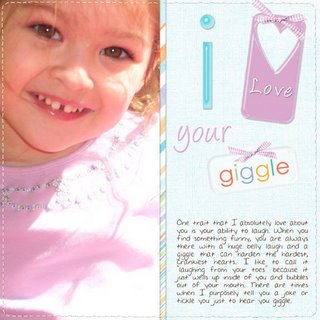
 I absolutely LOVE this picture of Melissa and knew it had to be the one to use for the scraplift! I used the Shabby Princess's Splendid kit and recolorized the bows. I am very happy with the way it came out!
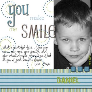
  This is Susie's entry and what a great job she did - this is her first entry here at the blog!! "I took this picture shortly after I got my first digital camera. I loved it so much and this challenge seemed perfect for it. Thanks for making me finally scrap it.
Fonts: butterbrotpapier, Eras Light ITC, Susie's Hand, 28 days later, “You” - Girls Are Weird with Atomic Cupcake Chipboard Effect
Paper: Sarah Jones: Aberdeen kit from the digichick
Epoxy squares: Hather Roselli: Mint Chocolate Chip kit from the digichick - colorized
SMILE alpha: Urban Kiwi kit from the Shabby Princess
Circle Dots: Heather Ann Designs - colorized
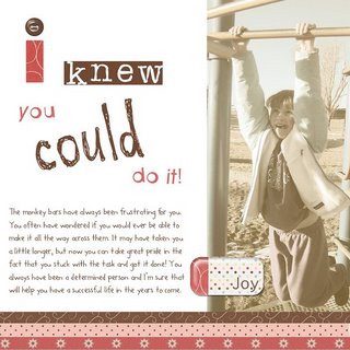
 This fun one is by Katie the Scrapbook Lady!! She didn't send the supply list so when you see this Katie - send me what you used?
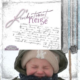
 This is Marie's entry - LOVE the look on his face!! Credits : Blizzard kit by Rachel ****son Fonts : AL Serenade, AL verdigris, Whiewash, Ma flirty, AL sandra

2 Comments:
I had better leave a comment then. This is a great one to lift and I'm looking forward to doing. Thanks for the challenge.
Hi Susan - Sorry I didnt' send a supply list!
The kit I used is by Christy Lyle and Mindy Terasawa (sweet shoppe) called "Floral Sky." The fonts are rubberstamp, LB bonus wonky, and 2Peas Frappachino.
Thanks!
Post a Comment
<< Home