I Can't Believe we're on #35 already!!! UPDATED
It should be closer to 48, but I missed a few weeks this past year! Oh the search for a lift to do is getting harder and harder because there are some truly incredible layout artists out there!!!! One layout really stood out to me this week and here it is:

You can see it ot DigiShopTalk.com here:
About a Boy
The layout I picked comes from Kim, user name tnkbuzan at DST...and this is what she says about her layout:
I've had a heck of a time making layouts for my son lately...he's eleven..right at that in between stage of little boy and teenager...
Paper are from AUTUMN PORTRAIT KIT, Jackie Eckles
Word art by Jackie from GREENLY KIT
Drop shadow actions by Katie Pertiet
www.desginerdigitals.com
Journaling: I sound so much like a mom when I say this....It sounds so cliché, but it’s oh-so true. Time goes by too fast and you notice it at the most ordinary,unexpected little moments. I watched you walk out of the room the other night and it hit me that you’re not a little boy anymore. It’s not just that you’re taller , it’s how you carry yourself...how you handle yourself when you’re around other people. You’re a confident, respectful and responsible boy. I’m glad you still have a few years of childhood ahead of you, and I’m proud of the adult that I’m beginning to see glimpses of!
===
I was drawn to Kim's layout because of it's clean lines and absolutely stunning picture. She combined it with heartfelt journaling and sparse but effective papers. I find it distinctive that she didn't use a plain white background to create negative space - instead she used a slightly textured and colored paper.
Join me in lifting Kim's wonderfully clean layout!!
===
As always, if you've done a lift and I've missed it somehow, please add it to the comments section here or email me a link to where it resides and I'll get it right up!
And here are the layouts and the ladies that jointed me in this challenge!!!

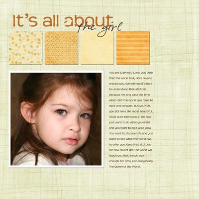
This first one is mine. I am SOOO happy with the way this one came out. Oh man is this new camera fun!! This is one of the first ones off the press!! It's wonderful to not have to spend an hour in photoshop getting a good picture!!! I really wanted to scrap right away with some of my Rebel XTi shots and this one was PERFECT for Gina Cabrera's new "Falling for you" Kit, available at digital design essentials! Falling For You
Fonts Teen and Jenn Olson

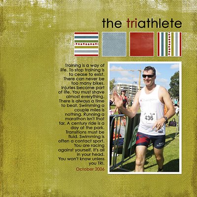
Next up is Sharon's Tri-Athelete Layout. She always has just the right touch to make the layout shine - like the idea of putting a white stroke around the papers - to mimic the photo edges!! Great job Sharon - and I really love your repetition of TRI!!! :-) Sharon says this: I am a big fan of Kim’s (tnkbuzan) … we met on a photography site, and I tempted her over to the dark side of digital scrapping, lol, and she is sooooo good. I love this layout because it has clean classic lines, great for the boys or men in your life. Great page, Kim! And thanks for the challenge, Susan!

This one is from Rachel, and I have to say it really made me choke up to read her journaling. I cannot IMAGINE having to be apart from my hubby as much as it sounds like she has to. I really adore her paper choices and the picture is just so full of fun and love!! She says, "I'm so thankful that my husband has come home to see us so often while he's been working out of town!
Credits: That Fall Smell by Heather Roselli
Fonts: Courier New, Anthony, 2Peas Fiddle Sticks

Finally - one of my all time favorite layouts of Karen's! Her journaling is so sweet and so true and that picture is just the cutest!!! Karen says, "My youngest daughter just climbing a chair in the hotel during our past short vacation. Nothing too dangerous, but I’ve been wanting to journal a little about the mixed signals I’m sending my laughing and taking pictures one moment and then the next I’m scolding lol.
Journaling = Being your mother, everything you do is cute and I always want to take a picture of it. And after I think I’ve gotten at least one good photo, I lightly scold you and get you out from whatever mess you were in. When I tell you to “look at mommy” while I’m snapping away on the camera, you must think you’ve really done something to be proud of and then in the next instance I’m whisking you off whatever obstacle you’ve managed to climb. Well…I guess some sacrifices will have to be made for the sake of preserving the moment.
Funky by Amanda Rockwell at Sweet Shoppe Designs
(part of the Back in Black Collection)
Atomic Cupcake Actions
font = Century, ReBucked

You can see it ot DigiShopTalk.com here:
About a Boy
The layout I picked comes from Kim, user name tnkbuzan at DST...and this is what she says about her layout:
I've had a heck of a time making layouts for my son lately...he's eleven..right at that in between stage of little boy and teenager...
Paper are from AUTUMN PORTRAIT KIT, Jackie Eckles
Word art by Jackie from GREENLY KIT
Drop shadow actions by Katie Pertiet
www.desginerdigitals.com
Journaling: I sound so much like a mom when I say this....It sounds so cliché, but it’s oh-so true. Time goes by too fast and you notice it at the most ordinary,unexpected little moments. I watched you walk out of the room the other night and it hit me that you’re not a little boy anymore. It’s not just that you’re taller , it’s how you carry yourself...how you handle yourself when you’re around other people. You’re a confident, respectful and responsible boy. I’m glad you still have a few years of childhood ahead of you, and I’m proud of the adult that I’m beginning to see glimpses of!
===
I was drawn to Kim's layout because of it's clean lines and absolutely stunning picture. She combined it with heartfelt journaling and sparse but effective papers. I find it distinctive that she didn't use a plain white background to create negative space - instead she used a slightly textured and colored paper.
Join me in lifting Kim's wonderfully clean layout!!
===
As always, if you've done a lift and I've missed it somehow, please add it to the comments section here or email me a link to where it resides and I'll get it right up!
And here are the layouts and the ladies that jointed me in this challenge!!!

This first one is mine. I am SOOO happy with the way this one came out. Oh man is this new camera fun!! This is one of the first ones off the press!! It's wonderful to not have to spend an hour in photoshop getting a good picture!!! I really wanted to scrap right away with some of my Rebel XTi shots and this one was PERFECT for Gina Cabrera's new "Falling for you" Kit, available at digital design essentials! Falling For You
Fonts Teen and Jenn Olson

Next up is Sharon's Tri-Athelete Layout. She always has just the right touch to make the layout shine - like the idea of putting a white stroke around the papers - to mimic the photo edges!! Great job Sharon - and I really love your repetition of TRI!!! :-) Sharon says this: I am a big fan of Kim’s (tnkbuzan) … we met on a photography site, and I tempted her over to the dark side of digital scrapping, lol, and she is sooooo good. I love this layout because it has clean classic lines, great for the boys or men in your life. Great page, Kim! And thanks for the challenge, Susan!

This one is from Rachel, and I have to say it really made me choke up to read her journaling. I cannot IMAGINE having to be apart from my hubby as much as it sounds like she has to. I really adore her paper choices and the picture is just so full of fun and love!! She says, "I'm so thankful that my husband has come home to see us so often while he's been working out of town!
Credits: That Fall Smell by Heather Roselli
Fonts: Courier New, Anthony, 2Peas Fiddle Sticks

Finally - one of my all time favorite layouts of Karen's! Her journaling is so sweet and so true and that picture is just the cutest!!! Karen says, "My youngest daughter just climbing a chair in the hotel during our past short vacation. Nothing too dangerous, but I’ve been wanting to journal a little about the mixed signals I’m sending my laughing and taking pictures one moment and then the next I’m scolding lol.
Journaling = Being your mother, everything you do is cute and I always want to take a picture of it. And after I think I’ve gotten at least one good photo, I lightly scold you and get you out from whatever mess you were in. When I tell you to “look at mommy” while I’m snapping away on the camera, you must think you’ve really done something to be proud of and then in the next instance I’m whisking you off whatever obstacle you’ve managed to climb. Well…I guess some sacrifices will have to be made for the sake of preserving the moment.
Funky by Amanda Rockwell at Sweet Shoppe Designs
(part of the Back in Black Collection)
Atomic Cupcake Actions
font = Century, ReBucked

2 Comments:
Had to jump in on this challenge ... I love Kim's work. I've sent you an email, Susan, with my layout! :)
Susan, I actually saw your version first (and then lifted it), but then somehow found my way to your site (and to the original version of the LO by Kim! lol). I love the concept of this site, great job!!
Here's a link to mine (even though I'm about a month too late! lol)
http://www.thedigichick.com/gallery/showphoto.php/photo/40372/cat/500/ppuser/9413
Post a Comment
<< Home